TopicAwarenessDevelopmentDesignTransport patterns & user needs
Viajar pode causar ansiedade para os indivíduos apoiados e suas famílias/carregadores, uma sala de relaxamento é um lugar muito necessário, tranquilo/seguro para escapar temporariamente do ambiente movimentado e em constante mudança da viagem.
As salas de relaxamento (lugares tranquilos/seguros) podem ser localizadas em locais públicos, como por exemplo:
centros comerciais,
Estações de autocarros,
estações de comboio,
e aeroportos, etc..;
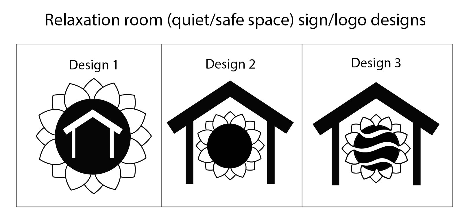
O design do logotipo destas salas tem de ser claro, facilmente reconhecível e representa com precisão um local relaxante, calmo e seguro para os indivíduos apoiados.
Qual dos três desenhos (por favor veja a imagem "Desenhos de sinal de sala de relaxamento") você acha que melhor representa uma sala de relaxamento (lugar calmo/seguro) para indivíduos apoiados?
Utilize a secção de comentários abaixo para nos dizer o que pensa.
Version 3 makes more sense but needs to be adjusted:
1. 80 -90% black for any line work, essentially a very dark grey, which remains fully legible.
2. Remove the roof overhangs - its obvious it is a roofline but its doesnt need to be so obvious that it dominates the graphic. Removing the overhang also lends a more contemporary look.
3. Similarly, the thickness of the roofline is not necessary. One continuous line, of the same weight, will imporve the graphic
4. The inner shade of the abstracted sunflower needs to be a further lighter shade, possibly 70%.
The designs are interesting. Although, in my view, the logo design could have some colours [one or two soothing colours] and include a silhoutte of a person sitting inside the home. Also, the line thickness of home silhoutte could be reduced. Designs 2 & 3 look like the flower is trapped inside the house; may be scaling down the object inside the house would work.
Clear communication to users might also need some 'text' along with the logo.
Designs 2 and 3 both have the "flower within a house" feature, which, in my opinion, best conveys shelter as the flower is being protected by the house. Out of these two, I prefer Design 2, as it is less busy, and I think that it has a clearer intent than 3. Although, could the centre of the flower be changed slightly, so that it is a little brighter (like Design 3)?
Design 1 makes me think of a temple, Design 2 makes me think of a garden and Design 3 makes me think of bees for some reason. I think maybe playing around with something more literal and recoganisable would be more useful such as the peace symbol etc. Not too sound harsh or anything, just my personal thoughts haha. Although If I had to pick then I would select Design 1. The flower petal reflect a sense of nature more then peace but it gives the illusion of you being surrounded by it in a room which is nice.
In my opinion, Design 3 the best represents a relaxation room for supported individuals. When I look at it I see shelter, support, peace and help. The white colour simmers me down and inspire my trust.


4 years ago